WHAT IS RGB? RGB is the colour mode that is usually associated with computer monitors…
Perfect print files
Do you have a piece of artwork ready for printing, but are unsure as to what format it should be in? What on earth is bleed and why do you need crop marks? There are a number of things you need to think about when preparing your artwork for print.
1. Navigate the Software Jungle
There is an ever-growing list of software available for creating artwork. But here are some of our preferences. Here is a list:
- For artwork documents and projects, i.e. brochures, stationery, display items, postcards etc: Adobe InDesign or Print Ready PDF
- Vector Graphics, i.e. logos, motifs, background graphics, frames, display text etc: Adobe Illustrator
- Photographs i.e. scanned images, digital photography, photo montages etc: Adobe Photoshop
- Text documents, i.e. digital text for insertion into existing documents & new artwork: Microsoft Word, WordPad, TextEdit, SimpleText, NotePad or similar.
We are able to accept most formats but deviations from the software listed above can often create problems as they are not provided for in our standard workflow. This is not to say that the above software are the industry standards, but they are considered pretty standard.
2. Set Up Your Document Correctly

InDesign’s document setup dialogue
When setting up your document the page size must be the exact size of the trimmed and finished object. There are exceptions such as folders and items that include multi-folds but we will be happy to advise you about those on an individual basis.
The document size must not include additional measurements for bleed or crop marks, as they must exist outside of the printing area. In software such as InDesign when you are creating the document, it gives you the opportunity to add bleed separately to the document size using additional options. If you are unsure of the options available in the software you are using, please call us and we can take you through it step by step.
3. Don’t Forget Bleed and Crop Marks

A page with crop marks and correct bleed
Bleed is necessary when the artwork extends right to the very edge of the page. Without bleed, when the job is trimmed, you will be left with a white edge to your printed item.
To avoid this we use bleed, an overlap of no less than 3mm extending off the edge of the artwork, so as when the job is trimmed the artwork extends neatly to the very edge with no visible white margins.
When a customer is unable to add bleed we have two options; the first is to trim the job under size, cutting into the artwork itself – as a result the job will be smaller than intended once finished; the second is for our mac operators to add bleed, this can be done by cloning the outer edges of the artwork. Although neither of these solutions are ideal, they are our only options when the original artwork isn’t available or editable by the customer.

A page missing bleed
Crop marks, also known as trim marks or registration marks appear at the corners of your artwork and are an indication to the print finisher of where to trim your job. When artwork is supplied in its original form, as a native InDesign or Quark file, we will add the crops marks when we output the job. If you are supplying a print ready pdf however, you must ensure the crop marks are already in place on the file when you send it to us.
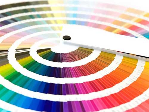
4. Check Your Colour Matching
The most important thing to remember when setting up your artwork is that what you see on your screen is not a good enough reference for what will print. All you have to do is fiddle with the brightness and contrast on your screen, and suddenly the colours are displaying differently.
If you’ve chosen a glorious sunshine yellow by using a picker or slider in your software, it could all be an illusion if your screen hasn’t been calibrated correctly. Which means when we print it, you could end up with a drab mustard colour or something even worse. For the best results you need to match your colours to something more reliable like a Pantone reference book or CMYK mixer chart. The secret is to trust your eyes rather than your screen.
It is also key to remember that if it’s printing in CMYK you must choose and set your colours using CMYK. Artwork supplied in RGB and then converted to CMYK can throw up unexpected results. The same rule applies for Pantone, although Pantone colours can sometimes be matched almost exactly by CMYK some, once converted, can differ drastically.
5. Fix Your Fonts
If you have created your artwork using a font that we don’t hold in our extensive font library, we will be unable to output your job. It is important that you include the relevant fonts when you send us your artwork.
The best way to do this is to perform a ‘collect for output’ or ‘package’ your job. This will create a folder

InDesign lets you package your fonts. Pay attention to warning messages.
that contains your document, all the links (i.e. graphics and images) and your fonts. There are licencing laws that prevent you from sharing your fonts with other users, as each set must be purchased for individual use. However, we do not take copies of your fonts for personal use and, therefore, no laws are broken. The supplied fonts are used for the express and sole purpose of outputting your job and then discarded.
Another way around the font issue is to convert all your text to paths. This removes the font information from the document and treats the text as a vector graphic. Remember, if you choose this route you must save a copy of your document with the fonts first, as once the text has been converted to paths and the document saved you will be unable to undo this or edit any of your text. ALWAYS create two separate documents so you can go back and edit your text if needed.
6. Size your Images Right
Resolution. What is it? In simple terms its the number of dots within an area or line, usually dots per inch (dpi) or pixels per inch (ppi), to be used when printing the image. You can resample an image to change the number of pixels and, therefore, the size or resolution of the image, but they must maintain a consistent relationship.
As size is increased the resolution decreases and vice versa. If you attempt to increase the resolution independently of the size you are in effect just cloning existing pixels, this will not increase the quality of the image. The higher the dpi the better the quality of the image when printing.

Pay attention to image resolution. 300 px/inch is best for litho printing.
By taking images from websites, not only are you breaking copyright laws if you don’t own the originals (tut tut), but you are also more than likely downloading a low-resolution image. Web designers decrease image size and resolution to around 72dpi to make viewing them on the internet speedier. This is suitable for screen viewing (known as screen resolution) but the results for printing are disappointing and will often lead to pixelation of the image.
Printers generally require a minimum resolution of 300dpi for Litho printing. We can produce suitable results with less resolution for Digital printing. Once you have your 300dpi image, it must be placed at no more than 100% size in your document. A 300dpi image placed at 150% actually decreases the print resolution to only 200dpi. Remember the size and resolution are relative, as the size goes up the resolution comes down.
If you are ‘packaging’ or ‘collecting’ your fonts using the software you can tick the option to do the same with your images. This will avoid the problem of missing images, please always make sure you include all of the files you’ve used.
Vector images aren’t resolution dependent, which is why we encourage their use wherever possible. For example if you have a logo as a vector graphic, you can resize the image to print at almost any size without the quality deteriorating.
7. Choose your File Format for Saving
The best rule is to stick to the native file format for the software you are using. i.e. .indd file for InDesign; .qxd file for Quark; .ai file for Illustrator; .psd file for Photoshop etc. If you are supplying a print ready PDF then obviously you will need to save your file as a .pdf.
When supplying logos or graphics that will be applied over the top of allover solid colours or in some cases over images, it is best to supply them as vector graphics as these naturally have a transparent background and you won’t have to contend with the white box area around the placed logo/ graphic.
You can create a transparent background within your Photoshop images using cutting paths but these must be created and saved correctly or alternatively using a layered .psd file. You can supply images in almost any format as we can convert them for you, but remember the rules around colour conversion and check with us first, as in some cases you may incur extra charges.
We advise that you resave all your images as CMYK 300dpi .tiff files before placing them in your artwork. For those of you that design for both print and web, don’t fall into bad habits by using your web files in your print artwork. Where possible avoid supplying files as .png, .gif etc.
8. Avoid The Pitfalls of PDFs
The invention of the PDF has been both a joy and a horror . It has enabled us, through varying

Creating a print ready PDF with inDesign.
technologies, to send customers proofs without the need to print and post them, keeping their costs and our environmental impact down to a minimum. A PDF that has been created correctly can be output in a quarter of the time of standard artwork.
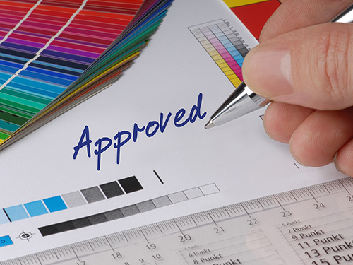
If however, the PDF is not what we call ‘print ready’ and requires intervention from our mac operators, or editing by the customer themselves, the process can be lengthened indefinitely. The intention of the pdf workflow is for the customer to provide a ‘print ready’ PDF that includes bleed and crop marks (see above) and is high resolution. The file must also be proof passed by the client so as to minimise the chance of there being any amendments.
PDF Check List
Your PDF must be:
- Centred
- With crop marks
- All fonts must be embedded
- Images must be a minimum of 300dpi, no RGB or LAB colour profiles
Where possible we will avoid making amendments to PDF’s as we risk the introduction of errors by altering the file. For further help producing PDF’s please get in touch.
Related Posts